Simple bar charts are the most common when it comes to data visualization. However, scatterplots can be a very crucial method when it comes to data presentation. A scatterplot can be defined that shows 2-dimensional space values using coordinates. It is very important because it shows you the relationship between two variables the trend and the bigger picture at a glance.
Steps for creating a scatter plot on Google sheets
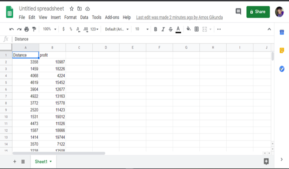
Let’s use an example of two random sets of data up to 250 values like the one in the picture below.
Follow the following steps to create a scatter plot.
1. Highlight your columns including the header row too
2. Click insert chart
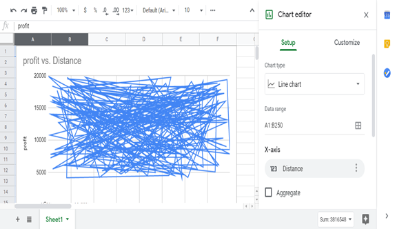
Initially, a very terrible chart like the one above will be created. All the 250 rows will be represented in the form of yikes that are difficult to read. To fix this graph to a scatterplot is a very easy task.
3. Choose the scatter option on the chart menu. You will easily notice it since it is represented by many small dots on the chart type drop-down menu.
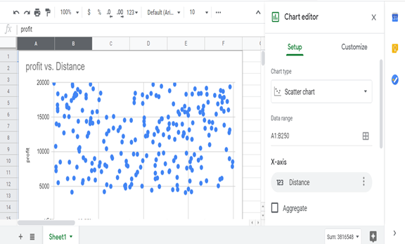
4. Your scatterplot is now ready.
How to customize your scatterplots.
The most important benefit of a scatterplot is that it allows us to visualize and absorb the dataset wholly. However, you will read the values as coordinates. For instance 1402:4169.
If you want to change the colors follow the following steps:
1. Click on the 3 vertical menus trigger the chart editor
2. Click on customize
3. Click on format color and choose any that you like
Also, you can increase the size of the dots by changing the point size in the setup tab. On this chart, you can customize so many other things such as the point shape. Instead of using circles to represent your scatter plots, you can use many other shapes that will bring a great visual impression for your data. For example, if you are representing mountains then triangles would be the best shape to use.
That’s all for making a scatterplot on your google sheets.