
A kite diagram is not your everyday chart on Google Sheets. It is a diagram that graphically shows the distribution of a sampled phenomenon along with a constant sampling rate. It can be used for statistics, but those who use kite diagrams most are geographers and geologists to map vegetation, animals, or other species along a sampled transect.
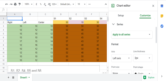
To create a kite diagram, you will need two types of data. The first is a range of sampling points or sampling rates, e.g. counting vegetation cover every 5 meters. The other is the magnitude or value of each of the species, e.g. grass, pine tree,
The kite diagram is essentially a graph, so you should plot it and draw it like one. Here’s how in 5 simple steps.
How to Draw a Kite Diagram
1. Plot your transept range on the x-axis with the scale being the interval at which samples were taken.
2. Put your different species on the y-axis. As your scale, use half the highest distribution of species as the basis for determining your scale. For example, if the highest number was 10, then have at least five small boxes between the names of the species because the diagram will cover both sides of the line.
3. Plot the relative density or distribution as a kind of line diagram on each side of the line representing each species. Each side of the line will be a mirror image of the other.
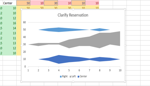
4. Shade the area between the lines in different colors to differentiate them and make them stand out.
5. Create a corresponding legend and name it appropriately.
That’s how you create a kite diagram in Google Sheets. To make plotting it easier, remember to take your samples at regular intervals.